Zero Grocery
Navigation, Browse, & Search
Similar to in-person shopping, an exciting and successful online shopping experience depends on a customer's ability to search, browse, and navigate a store's catalog.
How do we combine these elements to create one seamless online experience that works for customers with all types of shopping intentions?
Role: Product Designer
Timeline: July 2021 - November 2021
Org Collaborators: Retail, Growth, & Engineering
BACKGROUND
Existing UX & UI
Our customers' current navigation, search, and browse experience are separate functions with little overlap.


User Objectives
- Easily find SKUs that meet specific or multiple guidelines and restrictions.
“As someone who is gluten-free and enjoys shopping local, I'd like to be able to view items that fall under those two categories easily.”
- View all and narrow down searched items.
“I’d really like to be able to see all of and filter through my search results instead of flipping through each page.”
- View items in search that are relevant
“I have a tough time using the search bar; instead of offering me the most relevant item, it first shows me products that contain what I search as an ingredient, instead of the item itself.”
Business Objectives
- Improve discoverability of products within the catalog
Increase Discoverability → Increase AOV & Brand Value
- Future-proof navigation for a catalog expanding beyond just groceries.
- Create a more harmonious flow for customers first entering the site to the product list pages
Decrease initial user drop off rate with a seamless transition from initial site contact → catalog browse
Limitations & Scope
This project was moving at a fast pace and with limited engineering resources. Designs needed to meet the customer and business objectives while remaining technically lean.
I also had to ensure that new designs would function parallel to how SKU input is performed in our dashboard by the Retail team.
MAPPING
UX Flow
Designed to tie navigation, search, and browse into one cohesive experience on two screens. Each department would get a landing page to feature products. Search and categories navigate to the product list screen where items can be filtered down or sorted.

Use Cases
Use cases define specific functions that this new feature should include.

TESTING
Prototype Testing
Prototype validated by testers. Conducted desktop and mobile tests on three flows: Navigation, filtering tag and subcategories in category browse, and search.


Key pieces of feedback:
- Difficulty visually differentiating the top tags from the subcategories.
“It’s hard for me to tell the difference between the tag buttons above the products and the tags underneath the filter; they look the same.”
- Filter column options were challenging to navigate
“Once I really look at the filter options, they make sense, but they aren’t clear from the get-go.”
- Mobile filter modal gestures conflicted with each other.
“I find it challenging to scroll through the mobile categories when scrolling down causes the popup to close.”
- Navigating to a new category from an existing category with active filter settings was not intuitive.
“If I have filter options selected in one category and I move to browse through another, I’d expect the filter options to clear.”
How I addressed it
- I moved these tags to a lower section with a different interaction. I maintained the active tag button at the top for extra visual confirmation.
- I spaced out the filter categories and inserted a horizontal line for visual separation.
- Instead of a scroll interaction for mobile category options, I opted for dropdowns.
- The UX of this interaction changed from maintaining the filter options to clearing them when a customer moves from one category to another.
FINAL SOLUTIONS

A category page with options to filter by tag, on the left, or subcategory, at the top.
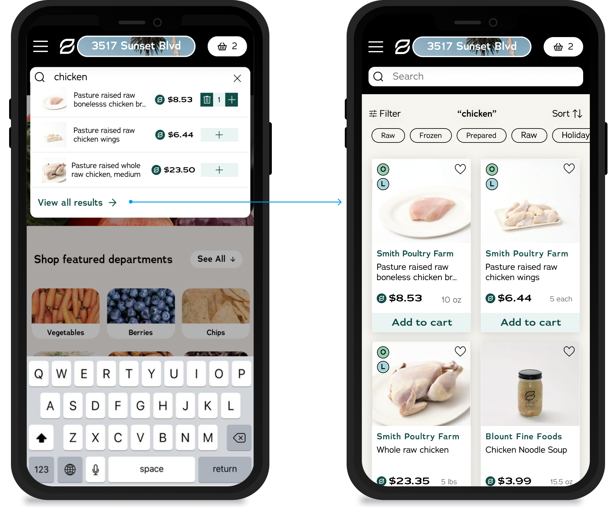
Search dropdown to search results page in mobile. Customers can add directly to the cart in the search dropdown or view all.
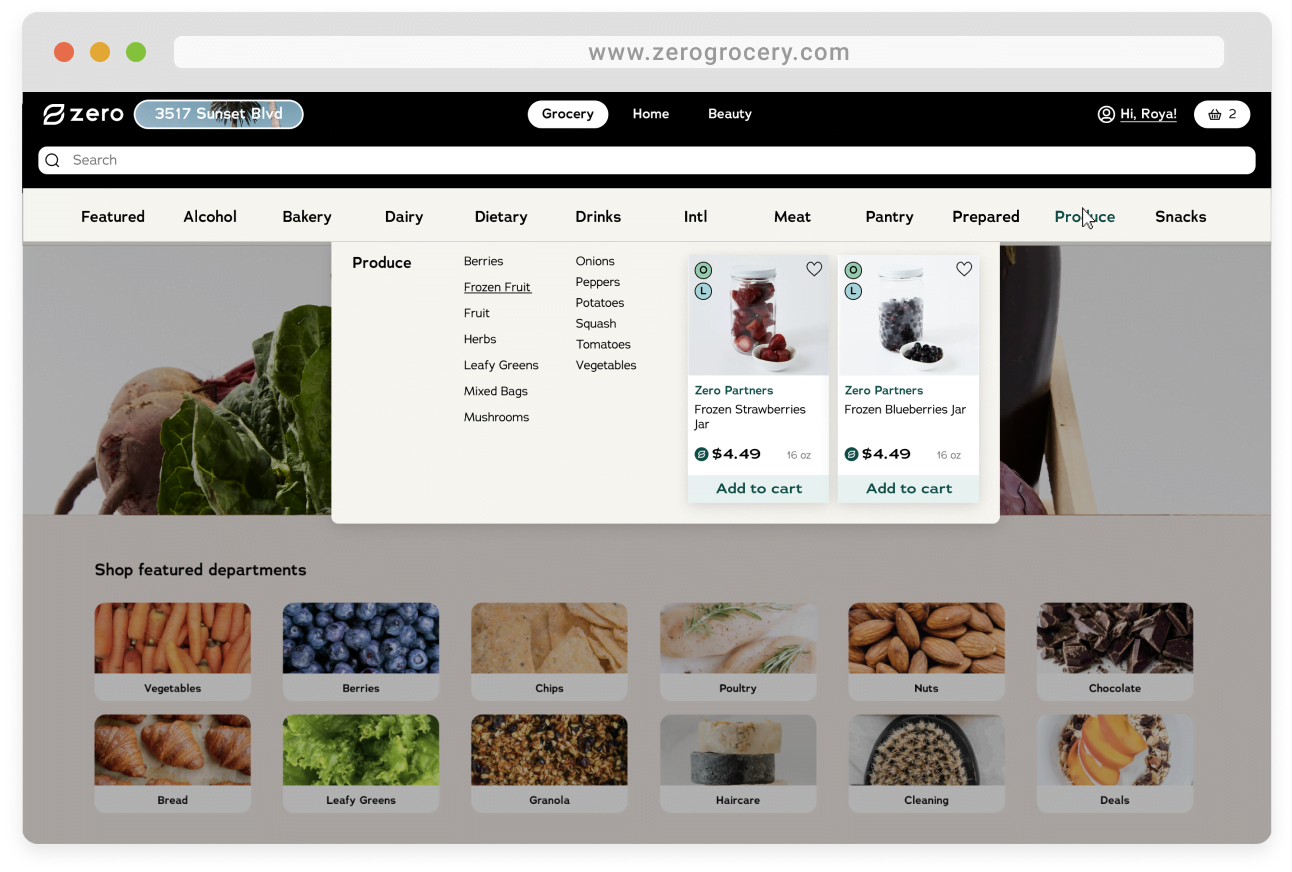
Department landing page with category hover state active. Hover state displays subcategories for customers to view the breadth of the catalog from the landing page.
TAKEAWAYS
What I learned...
- This project was structurally complex but led to pretty lean designs that worked for all stakeholders. I learned throughout this process to be in constant communication with all orgs involved to prevent backtracking.
- I learned about designing customer-facing products that also fit the parameters of an internal system.
What I would do differently...
For this feature to function successfully, it needed to align with Zero's SKU input function in the dashboard. I was asked to go into this product with no knowledge of how the dashboard works with the idea that after creating the designs, we could descope it to fit the flow with the dashboard. While I understand removing prior knowledge limitations, I think the process would be more efficient if I designed it with some background knowledge of the dashboard, especially given the shorter timeline and quick pace.
Hey again! You've hit rock bottom... of this page ☺
If you want to learn more about me, what I'm working on, or what I'm up to, feel free to reach out!