Zero Grocery
Cart, Conversion, & Checkout
The cart and checkout process is crucial for customer acquisition and revenue goals; however, customers didn't perceive the benefits of Zero's memberships enough to convert. Improving UX and UI can enhance clarity during checkout and boost cart conversion rates. How could we optimize our existing design to achieve better metrics?
Role: Product Designer
Timeline: June 2021 - August 2021
Org Collaborators: Growth & Engineering
BACKGROUND
Existing UX & UI
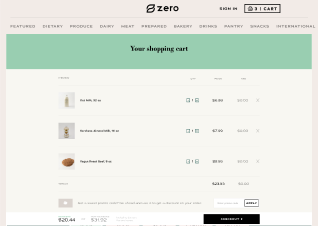
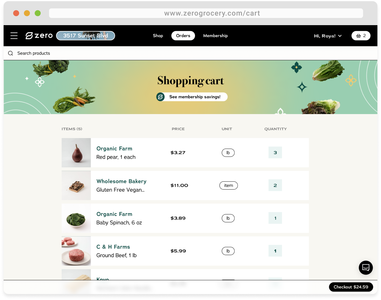
Our customers' existing UX and UI had similar buttons that went to different places and multiple full-page screens that could be shortened into a quicker checkout experience.
Customer Experience

Screens


USER RESEARCH
Primary Interview Takeaways & User Challenges
“I'll place an order, and often only three-quarters of it will arrive. I have no way of indicating ahead of time which item I want to be substituted and which item I'd rather just have refunded - then I get these random items in my delivery that I don't need.”
“I wish there was a way to know when my order is arriving. I get hesitant to place an order unless I know I will be home all day to get my delivery out of the sun.”
“I feel like there is a lot of information that I need to take in and fill out with each one of these [date selection, membership selection, account information fill out] screens. It's quite overwhelming.”
Customer Objectives
- Some buttons skip over the cart and go right to selecting dates, while others go to the cart. Customers were looking for consistency in where they would be going in the cart/checkout process.
- Out-of-stock was an ongoing issue for Zero deliveries; customers wanted to substitute OOS items.
- Customers wanted the option to specify a time or a window for order arrivals.
- Screens that support easier information processing
- Customers wanted the ability for recurring non-member customers to save their address and credit card information for faster checkout.
- Receive visual confirmation that their order has gone through and understand where they need to update, edit, or add to their order.
Business Objectives
- Communicate the value of the membership.
- Update the existing UI to mirror the refreshed brand and UI.
- Decrease cart abandonment metrics by optimizing the cart to checkout UX.
- Optimize data entry for a speedier checkout.
- Set preventative measures for out-of-stock items to fix the problem before the customer needs to speak to Customer Service.
Limitations & Scope
The project progressed rapidly with limited research and engineering resources. Designs had to align with customer and business objectives while maintaining technical simplicity for implementation.
Zero faced challenges in deciding when certain features could be technically implemented. There were ongoing discussions about whether these features should be available to customers for the Version 1 launch or considered for a fast-follow approach.
MAPPING & SKETCHES
UX Flow
The new checkout flow is linear and faster- customers can quickly select and fill out their information while knowing where the flow will direct them next.

Sketches
Early sketches explored sign-in pages, how membership options could be displayed, and order summary dropdowns.


TESTING
Prototype Testing
Mobile and desktop prototypes validated by testers and business stakeholders.
*Note: Some features were not included in V1 prototypes but approved as fast-follows.


Key pieces of feedback
- Customers were unsure how to increase or decrease the quantity of the products in their cart.
- The checkout button and subtotal and total prices were too small and hard to locate.
- Specific components of the Order Summary felt like they didn't necessarily need to be dropdown items.
How I addressed it
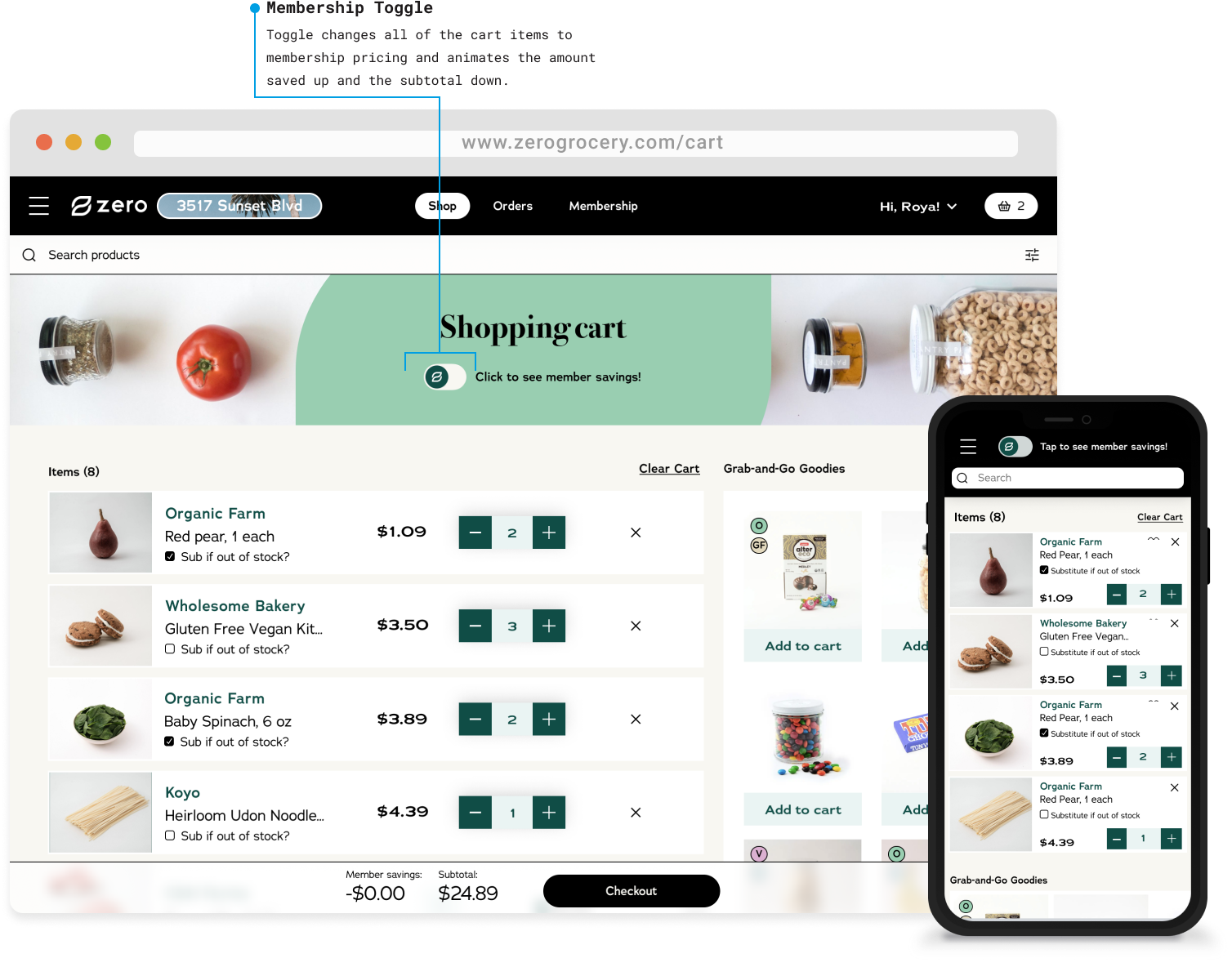
- Adjusted the cart item cards to display the quantity with the + and - buttons on either side for easy adjustment.
- Made the buttons to continue to checkout and after checkout larger and adjusted the language and placement of both to be apparent.
- Removed the dropdown items for components that needed to change each time someone made an order, such as the date selector.
FINAL SOLUTIONS

Itemized cart screens with search enabled for any last-minute additions. The option to substitute feature was added as a fast-follow.
Grab-and-Go Goodies was a feature I pitched when I saw an opportunity to improve product discoverability and Average Order Value while making use of extra space.

I consolidated the date and tip selection screen, membership selection screen, and the address and billing fill screen into one screen. Address and billing pre-filled for returning customers, membership component not displayed for members. 'View/Edit' → Cart.

Mobile order confirmation screen. 'View order' → Order details page. 'Edit order details' → back to order summary.
OUTCOMES
Cart exits decreased by
48.5%
Checkout exits decreased by
40.67%
The Average Order Value increased by an average of
$10 per order
TAKEAWAYS
What I learned
- There were a lot of supply chain challenges that involved items being out of stock on the day of delivery - this was a big pain point for customers. Working on this project, I learned a lot about setting expectations for teams for the issues that my role would help support and advocating for reasonable expectations if the underlying problem is not solved.
- While I was designing this updated experience, there was a lot of back and forth about whether or not certain features would be available to implement from the engineering team. Because of the uncertainty, I had to design V1, fast-follow, and dream states for certain features. We were able to move forward with some, and others we were not, but it showed me the importance of future-proofing while designing.
What I would do differently
After working on the cart, conversion, and checkout experience, I was quickly moved to another project. While the overall metrics improved for membership acquisition, AOV, and cart abandonment after launch, I would have liked to take the live experience through more testing and HotJar observations to further iterate for new pain points.
Hey again! You've hit rock bottom... of this page ☺
If you want to learn more about me, what I'm working on, or what I'm up to, feel free to reach out!